

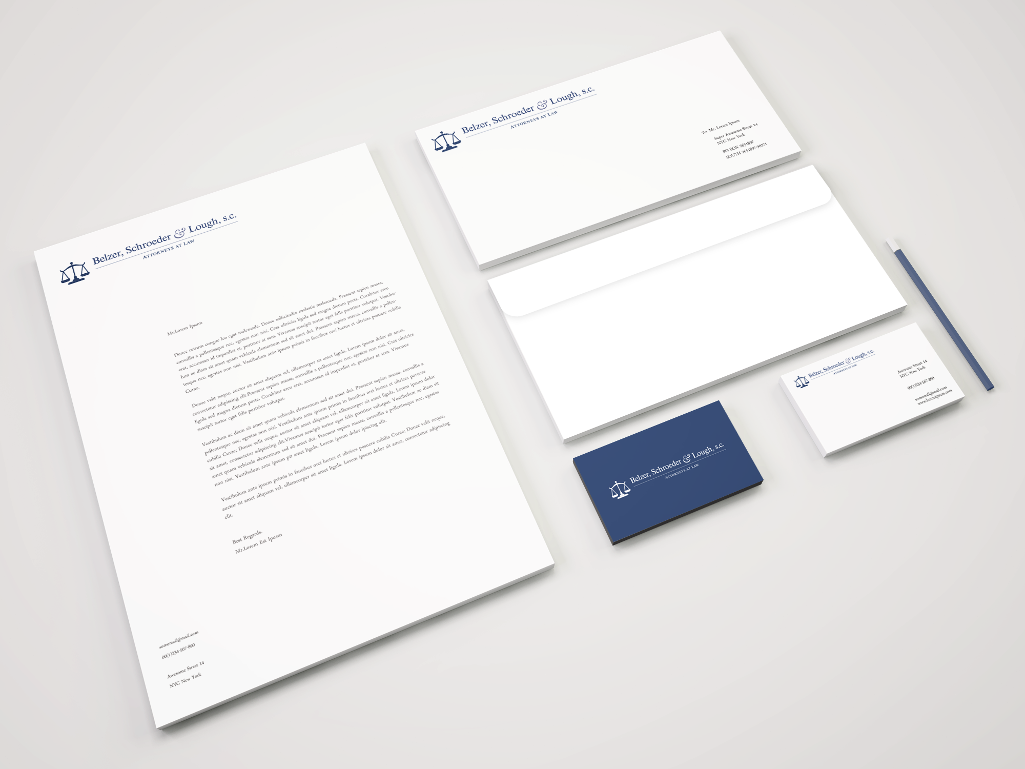
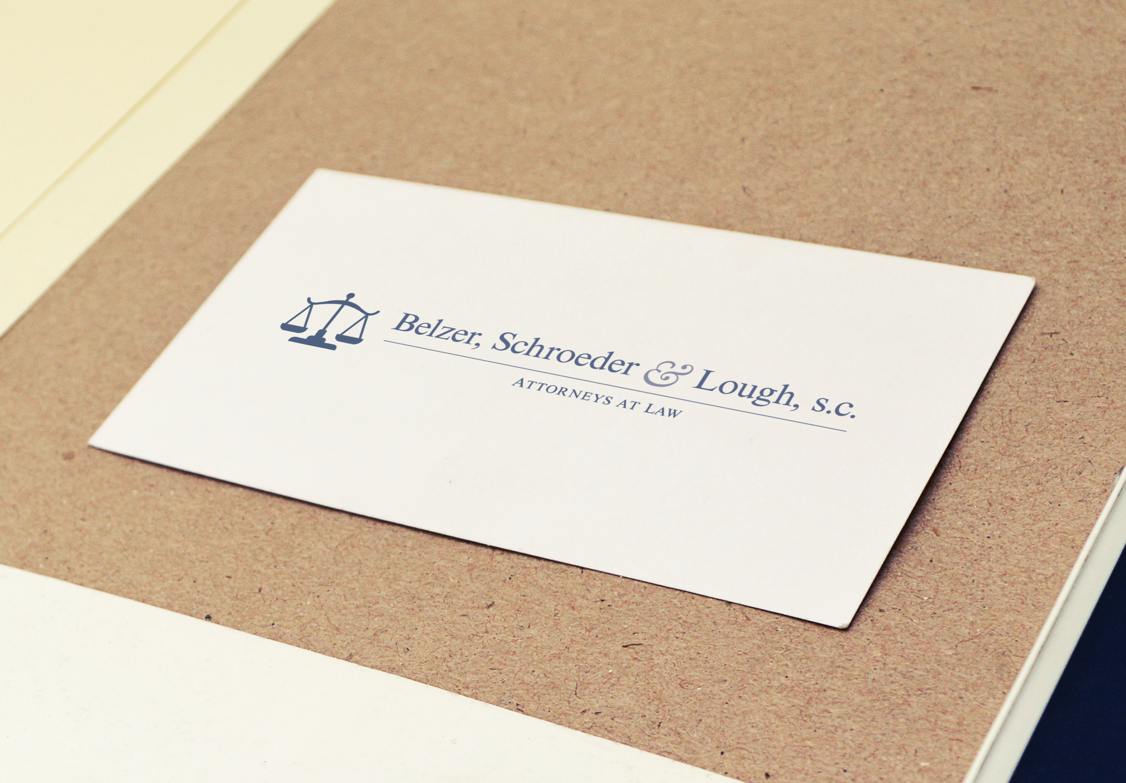
Belzer, Schroeder & Lough, s.c.
Logo
Logo redesign commissioned by a family member's law firm. I started with 6 variations (ranging in ambition and style) but I quickly found that it is a tricky process designing a logo for a law firm, because it is essential to tow-the-line between flashy and "professional." I wanted to make something exciting and eye-catching, but it was important to still maintain a subdued and sophisticated feeling. Fun, elegant, but nothing too crazy. The final product needs to convey "serious," and its easy to get carried away with flashy, modern trends in early stages. Ultimately the firm decided on one of the more subtle variations, which I proudly believe has a very timeless essence, while introducing some tasteful flourish in the use of shading, the mark itself, and the type ornamentation.